Here is everything you need to start building notion charts.
Charts are great! But until now they have been missing from Notion.
Nochart is a chart builder tool dedicated to Notion. Just connect your Notion databases to Nochart and you will be able to create a chart in a minute.
Make your first Notion chart
First step is to decide what you want to visualize. It can be anything you have on your Notion.
If you don't know where to start, don't hesitate to have a look at our free templates:
Alright, You have chosen which database you want to turn into a chart?
For this article, we will use the Starter template.
Great! Let's build your first chart.
Head over to Nochart.co, signup, go to your dashboard and click on "create my first chart".
1. Connect your Notion workspace
Connecting your workspace is easy as clicking on the connect to Notion Button and selecting the page you want to share with us.
Connecting to your Notion workspace
⚠️
Notion can take some time to share with us the database that are in the page you selected.
If you want to speed up the process, we recommend searching directly for the database you want to use.
Once we have access to the database, you should be able to select it.
Here we select Example Table - Monthly Revenue.
2. Build your notion chart
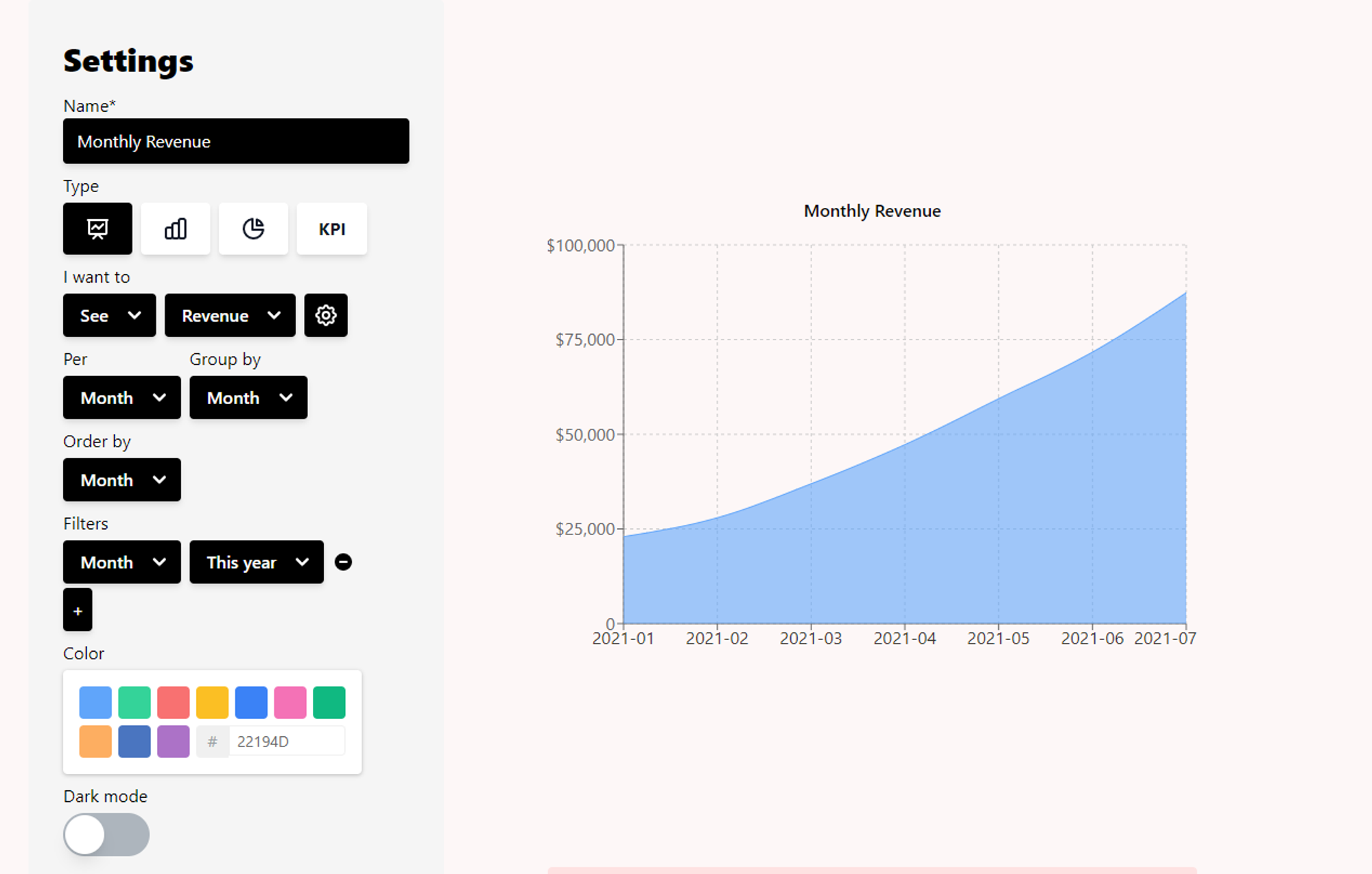
Once you selected the database you want to visualize, here is what you should appear on your screen:
Nochart's chart builder
On the left side of the screen you have the settings for building your notion chart.
In this area, you will be able to:
Name your chart
Select the type
Choose what you want to "see"
Order your chart
Filter on different value
Customize the color
Select the dark mode
We will go through all of these steps one by one.
1. Name your chart
Enter a name that will represent well what you want to visualize.
Here we will enter "Monthly Revenue".
2. Select the type
Select the type of chart you want, at the time we are writing this tutorial, you have the choice between 4 types:
Line chart
Line charts are great when it comes to visualize something evolving with the time. Just like our monthly revenue
The line chart we will end up with
Bar chart
Bar chart are best to compare different categories.
Bar charts where we display monthly expenses per category
Pie chart
Pie charts are great when you want to visualize how much each category represent as a proportion of the whole.
This Pie chart show that most of the books are already finished
KPI
KPI are greats to resume a situation at a glance. I like to complement charts with KPIs
Here KPIs are the total expense and this month expense
Let us know if you need more 🙂
To view my monthly revenue, I prefer to visualize it with a line chart, but feel free to select a bar chart.
Name and different type of charts
3. Choose which data you want to visualize
While doing user research, we realized that, when it comes to create charts, a lot of people struggle with classical chart builders.
What is X? What is Y? Where are they?
To simplify, the process, we decided to create a syntax that is closer to the way you would describe what the chart does in English. "Sum of the revenue per month"
And that's exactly what we will input :)
The field to fill are :
I want to
Calculation
See/Sum
See and Sum are interpreted in the same way. If you choose one of them, it will simply sum all the element you selected
e.g. In our example, we want to sum of all the revenue per month
Count
Count is uses when you want to count how many times an element appear in the tables.
e.g. If I want to know how many task per status, we will use count
Average
You name it, you'll get the average value of the element you selected.
e.g. Average ratings per author
What
Select what you want to visualize, in our example we want to visualize the revenue.
You can format the Revenue by clicking on the setting button
Here our Revenue is automatically set in dollars as in our notion database.
Per
Select by which column you want to group the data. In our example, it's the collumn month which is a date.
When the value is a date, you can select the period between days, month, year.
If you want to display a KPI, you will just have to fill the calculation and the value you want to display.
As example if I want to get the total revenue, I can just select Sum revenue and voilà 😉
KPI Example, That's a lot of revenue 💰
For the article, we will want to visualize our Monthly revenue, which is really the sum of each revenue we had per month. And since our Month column is a date, we have to choose group by Month.
Much WOW! Our notion chart is already looking good!
4. Order your notion chart
Ordering is quite important to get a good chart readability.
By default, it will be ordered by the columns you selected in "Per".
If your column is a date or a number, your charts will be ordered ascending.
And if it's a text, the chart will automatically be ordered alphabetically.
Sometime in your Notion database, your date is a text, so your chart will by default order alphabetically. But you can fix the order of your chart with formula, have a look at this article.
In our notion chart, we will let the default configuration as we want it, ordered by time.
5. Filter on a column in your Notion database
Filter is another ineluctable feature of the charts.
In our example, we could for example want to filter for the revenue of this year.
Only Monthly revenue from this year
But if you need more, you can add as many filters are needed.
E. G. I want to sum revenue per date where the date is this year AND the revenue > 1000
Month is in this year AND the revenue > 1000
6. Customize your chart's color
Life without color is not fun, neither are charts!
You can customize the colors of your charts.
Color Picker
For the bar chart and the pie chart, you have the choice to have a multi color chart or a single color, in which case you can select a color using the color picker or enter the color code in hex.
For the line chart, which is our case, you can only use the single color mode
7. Dark mode
If your notion workspace is set to dark. You might want to display your chart using the dark mode too.
Just turn the dark mode on if it's your case.
Notion chart in dark
8. Save your notion chart
Click on the save button and you are done.
Insert your chart in Notion
Once your brand-new notion chart is created, you obtain a link.
Copy your link and paste it on your notion page.
You just have to copy and paste this link into your notion page, click on embed and boom.
Your chart is on your notion page. You can resize the block and move it around your pages.
Refresh button- to refresh the data
Refresh your notion chart
If you make change to your database. You need to hit the refresh button of the chart to refresh it.
Edit your notion chart
Now that you have created your first chart, you can edit it at any moment.
Go into your Nochart dashboard, and click on edit.
The chart builder will appear and when a change is made to any field the save button will appear.
Don't forget to save the changes before leaving
Didn't find what you're looking for?
Don't hesitate to reach out via team@nochart.co or send us a message in the chat for immediate support.
We're always looking for new ways to improve Nochart, if you have a suggestion, please send us a message.

.gif%3Fid%3D8fbe3a80-a1df-4e03-af42-c2a0e0844bdf%26table%3Dblock%26spaceId%3D020f1e0f-2485-4c1e-a522-36307e5e802e%26expirationTimestamp%3D1722153600000%26signature%3D0R5Eu0gGqhPmlZjhKYLFeOko9215gvVxARGUgW2zqsM?table=block&id=8fbe3a80-a1df-4e03-af42-c2a0e0844bdf&cache=v2)


